Seamless Focus Architecture
Interfaces can feel both minimal and feature-rich - hiding complexity in plain sight through opacity, not through traditional show/hide patterns.
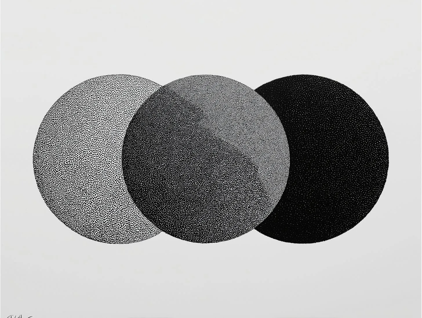
I’ve had an idea rattling around in my head for a while. UX for web and apps is generally “noisy”. We design with some version of focusing users, but it’s not really taken to the nth degree. We take half measures.
Like in eComm, we don’t add headers or footers with links, because that distracts people. We want them to focus on buying…buy mother fucker, buy.
But it doesn’t quite proliferate to the rest of the experience. Most views are cluttered. There’s a lot a user can do in any view, there’s so much going on.
So a practical example of this is if I am reading a blog post, do I need to see the elements of the sticky nav? Do I want to see the sidebar of “related articles”? Fuck no. I want the person to read the words on the page. That’s my only goal.
And that’s when this idea crystallized in my head: there is a principle that both focuses users AND is repeatable for multiple UX forms.
Let’s get into it.
’m calling this Seamless Focus Architecture – a design philosophy centered around taming noisy UIs. The designer “directs” attention, rather than giving every element the same level of it. We used to use accent colours for this, but that’s not cutting it.
Apple (future and past) does an excellent job of this. Their vibe with liquid glass is another iteration of it – the UI elements “blur” into the background… like a ninja!
They get out of the way so you can actually focus. Functions are part of the view, but they politely recede until needed.
The core principle is simple: one element commands all the attention, the others fade to the background.
Think – what should the user be focused on “here”?
There should be a clear hierarchy of focus in any view, but in UX today, this does not exist – there is so much noise, competing elements screaming for attention.
In this design system, one element holds primary status at 100% opacity, while all other “focusable” elements exist at reduced opacity.
This creates an intentional attention flow that guides user interaction without overwhelming the interface, providing that seamless experience where technology serves without screaming for attention.
It turns cluttered views into directed, seamless flows that respect the user’s attention like a well-trained AI butler.
But the implications are that this isn’t just for blogs or eComm – it’s a general principle that can be applied everywhere, from productivity apps to social feeds to AR environments, hiding complexity in plain sight.
Technical Implementation
The system works through three key technical implementations:
1. **Primary Focus State** - One element designated as .primary maintains full opacity
2. **Hover-Driven Transitions** - Mouse interaction transfers primary status between elements
3. **Default Return** - When cursor leaves interactive areas, focus returns to a predetermined default element
The beauty of this system is its simplicity.
The entire focus mechanism achieved with two CSS classes and a small JavaScript function:
/* Focused UI */

.focusable {

 opacity: 0.2;

 transition: opacity 1s ease-out;

}

.focusable.primary {

 opacity: 1;

}
The JavaScript implementation is equally straightforward, handling focus transitions through mouse events (but could be extended to eye movements in AR settings):
document.addEventListener('DOMContentLoaded', function() {

 const focusableElements = document.querySelectorAll('.focusable');

 const defaultPrimary = document.querySelector('.content-article');

 function setPrimary(element) {

 focusableElements.forEach(el => el.classList.remove('primary'));

 element.classList.add('primary');

 }

 focusableElements.forEach(element => {

 element.addEventListener('mouseenter', function() {

 setPrimary(this);

 });

 element.addEventListener('mouseleave', function() {

 setPrimary(defaultPrimary);

 });

 });

});
To all my developer friends, yes, the JavaScript function will bloat with a lot of elements in the view. That’s not the point. You can find an elegant solution, I’m sure.
Media-Rich Experiences
For media-rich experiences, the philosophy extends… or detracts. You have no primary element at all. Video backgrounds, images, or AR environments can exist without competing focus points, allowing the immersive content to command full attention.
The Impact
This approach changes, or clarifies, how designers think about information hierarchy.
Improving current layouts from static to dynamic, or “directed”, we create dynamic focus systems that reveal complexity only when needed. Elements exist in the DOM but remain visually de-emphasized until interaction demands them.
And for media-rich experiences, a simple slide in. It’s the same, but the focused element is the user’s view, not the primary element of the view.
And if used in both traditional and media-rich environments (web to AR) it becomes familiar. You get a seamless transition from your app to the AR HUD we’ve been looking for. Shout-out Tony Stark.
The result is that interfaces can feel both minimal and feature-rich - hiding complexity in plain sight through opacity, not through traditional show/hide patterns.
Repo here if you want to play around: https://github.com/kikileroy/focused-ui
Adios.